1in6
Branding
ROLE: Senior Brand Designer
CLIENT: 1in6.com (non-profit)
1in6.org is a nonprofit committed to helping men who have faced sexual assault lead healthier, more supported lives. When they approached me about refreshing their logo, the goal was clear: create a modern, approachable identity that could speak to a wider audience, especially those who might be hesitant to seek help.
The new logo needed to reflect both the seriousness of their work and the sense of strength and hope they offer. It was a chance to help reframe the conversation and make it easier for men to feel seen, heard, and supported.
Before & After
The previous logo communicated the cause very directly, which could feel a bit intimidating or clinical. Our goal was to design a more optimistic and approachable identity that creates a sense of safety, support, and encouragement for those reaching out for help.

Process
I began the process by sketching a range of rough logo concepts, exploring abstract and symbolic forms that could speak to the heart of 1in6.org’s mission. From dozens of ideas, I narrowed it down to three distinct directions: an abstract star representing the 1-in-6 statistic, a mountain range symbolizing strength through solidarity, and a lone tree standing tall.


Final Logo
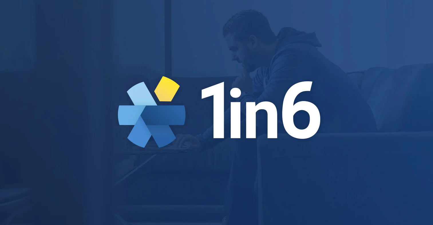
The final logo for 1in6.org features a bold, modern wordmark paired with a geometric symbol that’s both abstract and deeply meaningful. Six interlocking shapes form a subtle star as a visual nod to the statistic that 1 in 6 men will be affected by sexual assault. One segment is elevated and highlighted in gold, representing those directly impacted, while the surrounding blue tones evoke trust, support, and stability.
The result is a logo family that balances seriousness with approachability: inviting men to connect, seek support, and know they’re not alone.


Credits
Steve LePore Executive Director
Andy Langdon Creative Director
Ariel Roth Senior Brand Designer